“Sugar Daddy: Drawing Berlage’s Exchange”
Author Wendy Kohn
ArcCA 05.3 (2005): 30-35
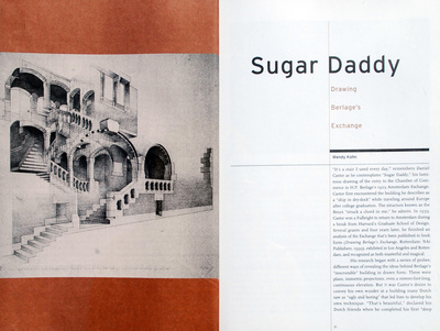
“It’s a stair I used every day,” remembers Daniel Castor as he contemplates “Sugar Daddy,” his luminous drawing of the entry to the Chamber of Commerce in H.P. Berlage’s 1903 Amsterdam Exchange. Castor first encountered the building he describes as a “ship in dry-dock” while traveling around Europe after college graduation. The structure known as the Beurs “struck a chord in me,” he admits. In 1993, Castor won a Fulbright to return to Amsterdam during a break from Harvard’s Graduate School of Design. Several grants and four years later, he finished an analysis of the Exchange that’s been published in book form (Drawing Berlage’s Exchange, Rotterdam: NAi Publishers, 1999), exhibited in Los Angeles and Rotterdam, and recognized as both masterful and magical.
His research began with a series of probes: different ways of revealing the ideas behind Berlage’s “inscrutable” building in drawn form. These were plans, isometric projections, even a sixteen-foot-long, continuous elevation. But it was Castor’s desire to convey his own wonder at a building many Dutch saw as “ugly and boring” that led him to develop his own technique. “That’s beautiful,” declared his Dutch friends when he completed his first “deep space” perspective drawing, “and if that’s the building, then it’s interesting.”
In his study, Castor focused on the zone of the building where Berlage, credited as Holland’s first modernist, pierced the austere flatness of his exterior elevations. The massive Exchange’s perimeter and its immediately adjacent interiors proved an “unending” subject: “the more I looked, the more I saw.” Castor’s eight “jellyfish” drawings, his term for these inside-out studies, possess this quality as well.
At first they seem factual: a careful transposition of three-dimensional, built form onto a two-dimensional plane. But the more your eye flows around and through the volumes of space depicted, the more you start to see solid and void, motion and stasis, lightness and weight simultaneously.
At 2 ft. x 4 ft., these large drawings suggest the interaction between calculated design and experienced tectonics in a way photographs or typical renderings are rarely capable of. Rather than definitive cuts through surfaces, as in conventional architectural drawings, slow fades move your eye from what is portrayed to what is left out. The technique extends the implied space of Berlage’s Exchange right out to the viewer’s own. It manages to evoke and analyze at once.
Working on the Exchange entirely by hand meant that each jellyfish drawing was essentially an experiment, a record of choices made during the rendering process. Even though the jellyfish technique allowed Castor to show many competing aspects of a single view at once—inside and out, above and below, surface and depth—he reached a moment in every drawing when he had to surrender the ambition to convey everything he perceived.
For two subsequent projects, on Bramante’s Tempietto and Trajan’s Markets, Castor built wire-frame models in Autocad as an armature for his rendered perspectives. The computer allows Castor’s choices to be more “premeditated.” Why did he study the Exchange with a mechanical pencil instead of a series of keystrokes? As Castor tells it, “Thoreau went to the woods to write deliberately. Well, I went to the Beurs to draw deliberately.”□


